Honeywell Design Systems
Building a design system for the SaaS APM mobile app
Contact Me

What was the starting point?
Interface Inventory
Global - With more than 4k employees building products, we needed a scalable system that will cater to different portfolio products.
Adaptive - The organization catered to different verticals such as warehouse, industrial plants etc and we had to ensure flexibility while developing these componetns.
A quick 1-min overview
Why was it done?
How success could be measured?


This process pointed out all the discrepancies across multiple mobile products. All these products have been using different versions or old design systems, hence creating inconsistencies. I also noted down the personas, framework that these apps were using.

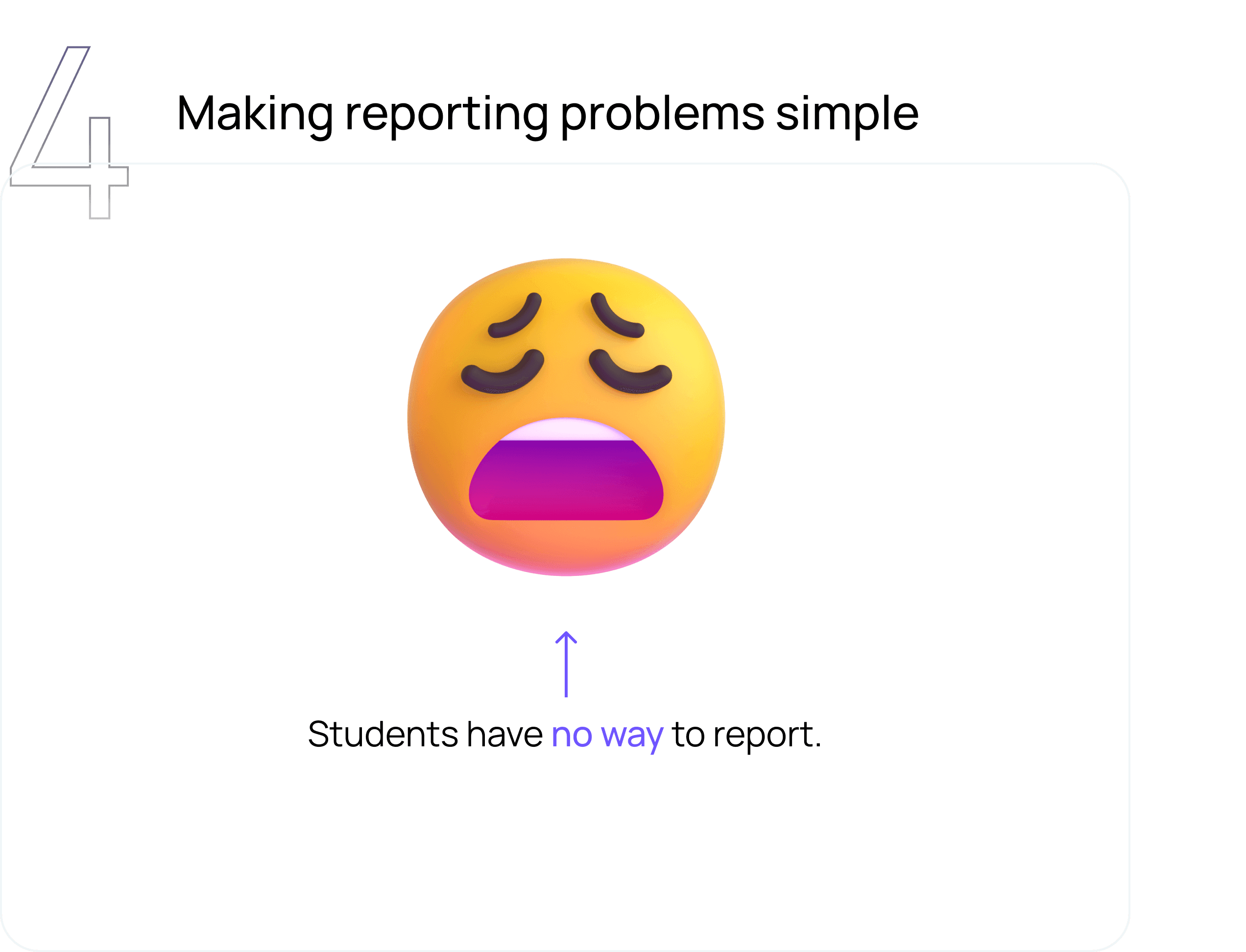
No Design System = Disconnected User Experience

Every mobile app has different way of showing terms and conditions, with a totally
different design language.
The login pages had different logos and also the usage of ios HUI library was misinterpreted and used incorrectly.
How did I approach it?
And, what are users saying?
I had to perform certain activities that would guide me to take the right direction.This really helped me to understand the existing design language and the market practices.
Currently, there is no established design system and we want to understand how designers work with little or no design system for Mobile and identify pain points and inconsistencies.
I Interviewed designers, Product Managers and their experience working with developers.
Sarah
26 years
User Experience Designer.
Goals
Frustrations
A session was held to prioritize elements that align with the collaborative efforts of both the business and design teams,We employed a combination of Brad Frost's "Interface Inventory" to identify and classify essential products and key individuals for inclusion.
Taking these factors into consideration at a very early stage, helped our team to partner the best with development team and refer
guidelines to enhance the user experience according to the framework..
Component Prioritization
Frequently used
Pick out components that are used the most often, study their behaviour and usage.
Since mobile apps cover such a large variety of use cases and different industries.
Widely Used
Mobile Specific
Build guidelines around the usage of component and figure out the feasibility of standardizing the component structure.
APM Building apps visual analysis
Material Design, HUI review
User research
UX Strategy
Identifying use cases
Now, Creating the vision
Setting the Guiding
Principles
To frame our new direction, we handpicked a set of guiding design principles. These principles would unite all designers while serving as key criteria to measure our work against.
So, what are the components
that I worked on?
But, let’s dive into one
component!
Bottom Sheet
The variants that I identified
Component Architecture and Variants
Accessibility compliance
Hi, I’m a chip
Hi, I’m a chip

MODERN
Look and feel like we’re
making the future

EMPOWERING
Put the user in control and anticipate their needs

ACCESSIBLE
Make it comfortable
for everyone
Bottom Sheet
Slider
Alert
Chip
Defining the problem
Designers reinventing the wheel
UI Consistency and increased user trust in our digital product.
Reduced time consumption and make collaboration more efficient between the teams.
Engineers going rogue
A robust design system
ROLE
IMPACT
UX Design, and Design System
2 new components
230+ variants in total

Error
Error message displayed here.
Spends most time on figuring out/tweaking
components designed only for iOS
Reaches out to the Design system team everytime
Expects guidelines on when to use what
Title
Button
Button
Close icon
Header
Footer
Content Section
Gives user alternate method to close
Sets the context for the user
Shows the steps for next actions/to apply
the selected options
Lets user to interact with different sections/
components that may/may not be nested.

It is commonly used to contain supplementary content that is relevant to the primary content on the main screen.
After a careful visual analysis , I was able to identify the challenges
1
When do we use Bottom sheet? and when do we use sort option, dropdown?
2
Should we construct bs based on screen size or content?
3
Do we design different versions for iOS and Android?
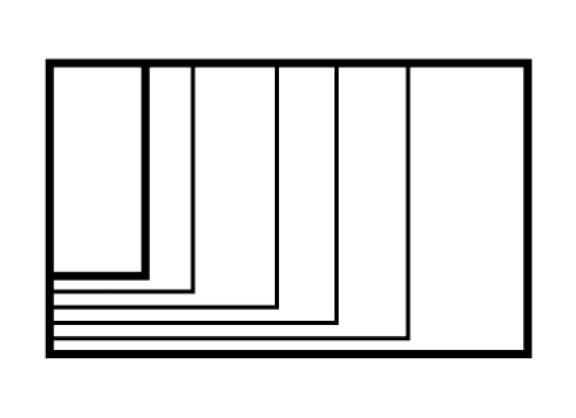
Fixed bottom sheet
Fixed bottom sheet is not resizable by the user and auto-sizes to fit the content.

Resizable bottom sheet
lets the user to resize by drag/swipe up.

Resizable bottom sheet (Scrollable)

To tackle these challenges, we engaged in ongoing reviews with the team to collectively make design decisions and ensure alignment on details. Biweekly meetings were held to showcase the progress to the entire global design system team, fostering discussions about the direction and advancement of the work. These approaches proved effective in bridging the gap.
The detailed breakdown helps the designers to quickly see all the variants and analyze if it matches the needs. The documentation has directions on the usage and the guidelines around it.
Each component that were designed was checked for accessibility compliance. I constantly referred the WCAG AA accessibility standards to make sure the designs are meeting them.
Resizable
It is crucial to design for all the use cases making sure that the content
will be visible even on smaller devices. It should also support users who
are using larger font size on their device, it might then get difficult for
them to get the complete view.
Touch Target
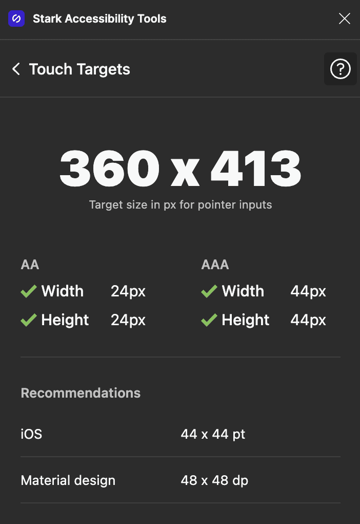
The top 48dp portion of the bottom sheet is interactive when user-initiated resizing is available and the drag handle is present.


Title
Button
Button
Item
Item
Item
Item
Item
Results
Faster design to market time
Single source of truth & a set of reusable components and patterns
Mobile specific guidelines

Efficient team processes
Faster design cycle
Less design system support
Time to deliver
No of code changes
Enhanced user experience
Fewer UI bugs
DS adoption
Time to completion
WCAG compliant
Used across products
So, what’s our strategy forward?
Target Users and devices
Honeywell Forge product has different types of employees using it, and for different JTBD.
UI Development
Should we follow adaptive or responsive design?
Latency
Considering the time to load.
Development Effort level
Which framework will suit the best for Honeywell Forge
apps?
1
2
3
4