Making library reservation
easier for students
Making library reservation
easier for students
Making library reservation
easier for students
Making library reservation
easier for students
Google Design Challenge
Google Design Challenge
Google Design Challenge

ROLE
UX Research, Design and Usability Testing
IMPACT
Reduction in time to completion
Increased feature adoption
ROLE
UX Research, Design and Usability Testing
IMPACT
Reduction in time to completion
Increased feature adoption


Behind the scenes
Behind the scenes
Behind the scenes
Problem Statement
“Your school wants to provide dedicated spaces for students to help them focus on their academic studies. Design an experience for students, professors, and members of the school community to reserve work desks/spaces in the library.
Checking availability
Reserving the space
Reporting any issues”
Final Outcome
Even though I couldn’t get to the next round, this case study bagged me
Even though I couldn’t get to the next round, this case study bagged me


other offers from top companies.
other offers from top companies.
A quick 1-min overview
A quick 1-min
overview
A quick 1-min overview
A quick 1-min overview
My goals were to:
Through synthesis of all the data gathered, I realized that students needed a system that would help them make college library reservations more accessible, streamlined, and transparent.
Through synthesis of all the data gathered, I realized that students needed a system that would help them make college library reservations more accessible, streamlined, and transparent.
Net Promoter Score
Net Promoter Score
Recommendation of the product.
Recommendation of the product.
DAU
DAU
We could measure by how many users that find the app useful enough to access it everyday?
We could measure by how many users that find the app useful enough to access it everyday?
Engagement
Engagement
Assess success by understanding how much people interact with the application
Assess success by understanding how much people interact with the application
Understanding the
significance of it
Understanding the significance of it
I wanted the data to drive my research direction and understand its significance.
01
13.5 hours/week
is the time spent on an average on campus studying, compared to only 4.3 hours/week
engaged in collaborative work.
13.5 hours/week
is the time spent on an average on campus studying, compared to only 4.3 hours/week engaged in collaborative work.
02
Their top-ranked library qualities center around space to complete focused, individual work, and when asked what resources are most important to libraries today, “quiet space for students” ranks first.
See Solution


So, what's the solution currently?
So, what's the solution currently?
So, what's the solution currently?
I set some initial exploration areas to understand the current process and get myself familiarized with the process.
I set some initial exploration areas to understand the current process and get myself familiarized with the process.


What are the considerations of students that reserve study spots?
What are the considerations of students that reserve study spots?


Is the current solution optimized to reserve a study spot?
Is the current solution optimized to reserve a study spot?


What challenges do they face while reserving a study spot in the library?
What challenges do they face while reserving a study spot in the library?
BEING IN USER'S SHOES
Empathizing with the users
Empathizing with the users
Empathizing with the users
I also calculated the time to reserve a study spot while getting myself accustomed to the system. This helped me to identify the parts I wanted to learn more about.
I also calculated the time to reserve a study spot while getting myself accustomed to the system. This helped me to identify the parts I wanted to learn more about.


What do the
current users think?
What do the
current users think?
Understanding the significance of it
I interviewed some of my peers to gain better insight into the user needs. I was also curious about their experience and emotions during the reservation process.
I wanted the data to drive my research direction and understand its significance.
“if students aren’t going, they
don’t cancel their reservations”
“The website is really difficult to use
and takes too long to reserve a
study spot.”
“I would like to know if there is
a cafeteria because I spend a lot
of time in the library”
“For a first time user, it is really
difficult to find my way in the
library. It takes up so much time”
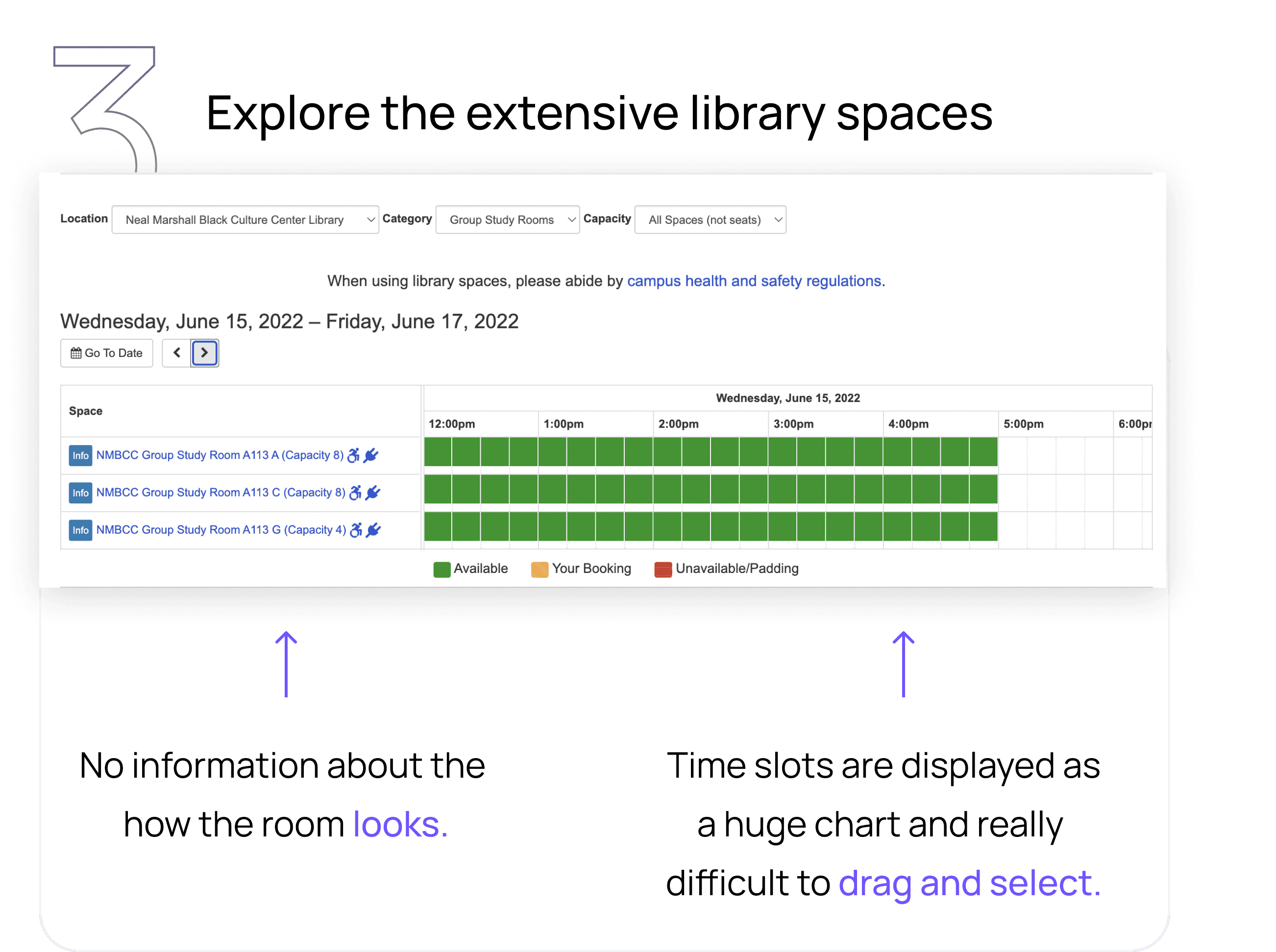
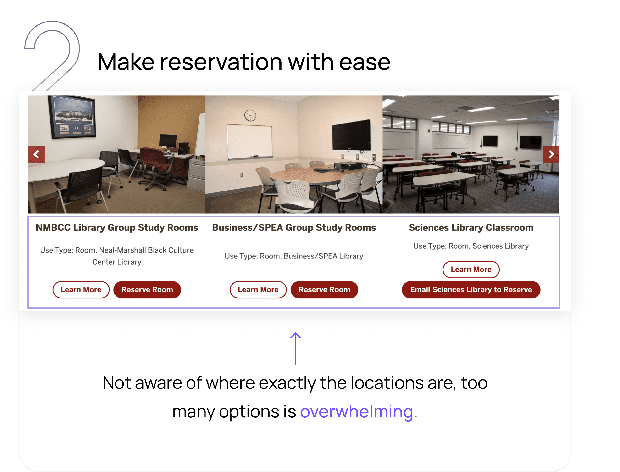
“I want to know which room is
where exactly - currently I can’t
know how it looks like”
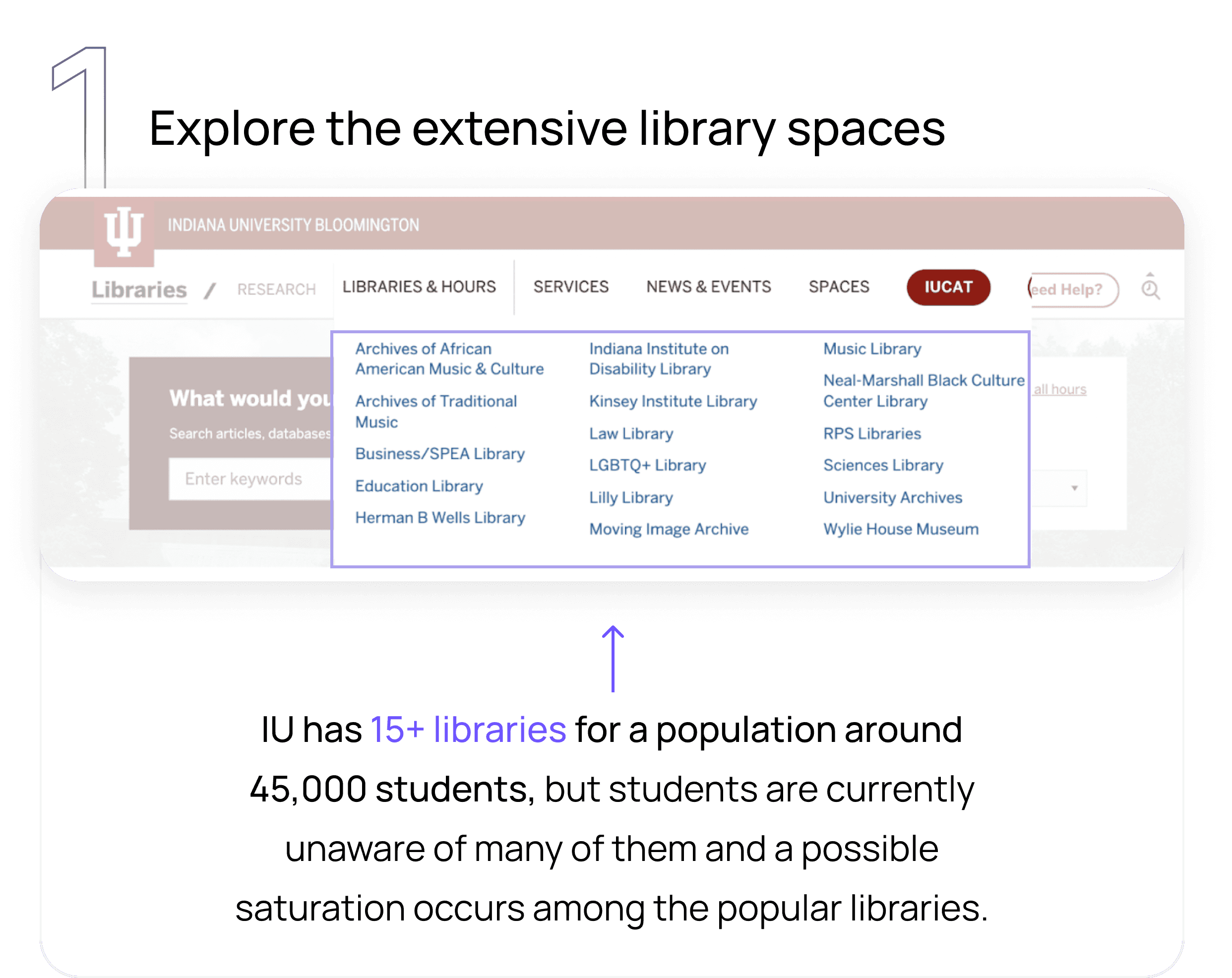
“I wasn’t aware of the reservation
system until I went to the library
and the staff told me”
01
13.5 hours/week
is the time spent on an average on campus studying, compared to only 4.3 hours/week engaged in collaborative work.
02
Their top-ranked library qualities center around space to complete focused, individual work, and when asked what resources are most important to libraries today, “quiet space for students” ranks first.
See Solution


So, what was my
strategy forward?
So, what was my strategy forward?
So, what was my strategy forward?
So, what was my strategy forward?
I studied the competitors


Mapping out the design opportunities


At this point, I had so many ideas! It was
rationalization time
At this point, I had so many ideas! It was rationalization time
At this point, I had so many ideas! It was
rationalization time
01
Does it help them in reaching the
closest library?
02
Does it address one of these key
problem spaces?
03
What's the possible impact on
success metrics?
Easy to use
Efficient
Accessible

IU Mobile app
Interactive Kiosk
One.IU portal intergration


Aah! Now, how does the
solution look like?
Aah! Now, how does the
solution look like?
Aah! Now, how does the
solution look like?


And do my design assumptions
cater to user needs?
And do my design assumptions
cater to user needs?
And do my design assumptions
cater to user needs?
1
Usability Testing
2
Talk-out-loud-exercise
Bridging the gap


Let's see the impact
Let's see the impact
Let's see the impact
I conducted task analysis with the interviewees to understand how long does it take and observe their emotions.


Time-on-task
12 steps ( 2mins approx )
7 steps ( 45 secs approx )
7 steps ( 45 secs approx )
7 steps ( 45 secs approx )
Don't stop, keep looking!
Don't stop, keep looking!
What do the current users think?
I interviewed some of my peers to gain better insight into the user needs. I was also curious about their experience and emotions during the reservation process.
“if students aren’t going, they
don’t cancel their reservations”
“The website is really difficult to use
and takes too long to reserve a
study spot.”
“I would like to know if there is
a cafeteria because I spend a lot
of time in the library”
“For a first time user, it is really
difficult to find my way in the
library. It takes up so much time”
“I want to know which room is
where exactly - currently I can’t
know how it looks like”
“I wasn’t aware of the reservation
system until I went to the library
and the staff told me”